Heads up! The screenshots in this article are from Clipchamp for personal accounts. The same principles apply to Clipchamp for work and school accounts.
On this page
A Facebook video thumbnail is like the cover of a book. While it can't tell you everything that lies behind it, it will give potential viewers an idea of what awaits them. An excellent Facebook video thumbnail might not guarantee someone will click through to watch—but a bad one can certainly put them off.
When you've spent time creating video content that your target audience will want to watch, you don't want to lose them at the last minute. It would be a shame to put in all of that hard work and see it let down at the last moment by a generic thumbnail without any context. All of this goes a long way to explaining why the videos that consistently outperform the rest on Facebook, nine times out of ten, use a custom thumbnail!
Since 85% of videos on YouTube are watched without sound, it’s important to both attract and summarize your video before the viewers even watch it.
Catching the eye of your potential viewers is essential, and the perfect Facebook video thumbnail is the way to do it. By using a thumbnail maker, you can achieve the results you’re looking for.
What is a Facebook video thumbnail?
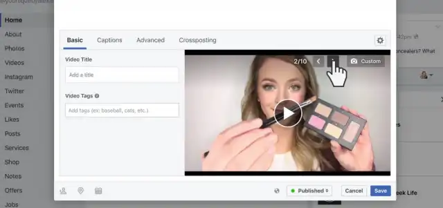
Your Facebook video thumbnail is a still image that viewers will see—on Facebook and in search engines—before a video starts to play.
Its role is, all things considered, straightforward. It should inform your viewers about what they're going to see when they click to watch your video.
Without a hard sell, it should raise their anticipation of what's inside.
Through a combination of visual cues and text, the thumbnail will show people, rather than simply telling them, what your content is all about.
You've heard that a picture is worth a thousand words: a good thumbnail is worth more!
If you've enjoyed a lot of video content in the past, then you've probably spent some time on YouTube and Vimeo. You'll have noticed how some videos have informative thumbnails.
Most of these will have some combination of text, pictures of the "star", and other visual information. For a given channel, the style of the thumbnail will usually be repeated across all of their content.
Some of the other thumbnails, for videos that may be every bit as watchable, are less informative. They may feature a randomly chosen still from within the video content.
Now, imagine for a moment that you were browsing movie posters. Would a shot of the lead character eating breakfast persuade you to watch an action movie? Of course not, and not making a dedicated thumbnail for your video will leave potential viewers asking themselves the same question—probably giving the same answer.
Why not use Facebook's built-in thumbnail tools?
Facebook itself offers you a choice of "dynamically chosen" images based on an automatic scan of the video.
These will be images that an algorithm deems relevant and vital to the Facebook content.
The primary drawback here is that Facebook can't really know what is essential to your potential audience. No algorithm knows what your video is trying to say, so it can't distill things in this way.
Picking the right images
If your video content is primarily someone talking to the camera, then a still from the content will likely do very little to inform viewers what they can expect.
“By making a dedicated thumbnail, you can ensure you don’t miss an opportunity.”
To make a long story short, having your own dedicated Facebook video thumbnail for each video makes them more clickable.
It allows you to give the viewer some idea of what they are about to watch and helps you build a solid identity to which your viewers will relate.
What is the Facebook video thumbnail size?
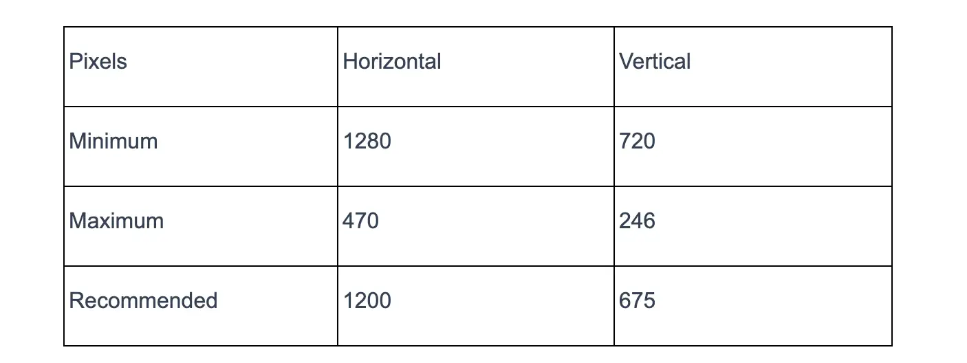
The maximum thumbnail size for a Facebook video thumbnail is 1280 x 720 pixels.
The ideal aspect ratio to aim for is approximately 1.9:1, and the intent should be to keep your balance as close to this as possible. This will give it the best chance to display correctly.
It should also be no smaller than 470 x 246; this is the size at which it will appear in people's feeds, and if it is any smaller than this, the thumbnail will appear distorted and bizarre.
As per the table below, the minimum and maximum sizes for a Facebook video thumbnail are:
Perhaps the best guidance for the ideal thumbnail size, though, is that it should be the same size as the video itself if possible.
This uniformity keeps things tidy and allows the viewer to focus on what is in front of them.
Examples of good Facebook video thumbnails...and not so good ones
Although a good Facebook video thumbnail for you might differ from those that work for other content creators, there are some facts that hold true.
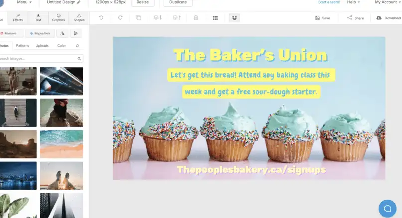
An example of a good Facebook video thumbnail: Image Source
For both good and bad reasons, the following are some rules your thumbnails should follow:
The thumbnail should have text in it, but it should not dominate the picture. You'll have the chance to post a description when you're putting the video live, so just a few words that connect to the images will be acceptable.
If there is a person in the thumbnail, take a separate photo of them rather than crop a still from the video. Stills are rarely flattering. Some default thumbnails have a picture of the content creator blinking or just starting to speak.
Use impact fonts for any text. Easy-to-read text helps keep people's attention on the visual information in the thumbnail.
The still should summarize the video. How you achieve this depends on the content. A travelogue will be best illustrated by an appealing still of the destination in question. A video about a news story should feature illustrative images of people, places, and or objects that relate to the story.
Include any branding for your business or studio in the thumbnail. If you have a logo, feature it somewhere separate from other text, so they don't distract from one another.
Use style and design trends to make your thumbnail better
While you want your thumbnail to stand out and look like "you" for the purposes of building a definitive brand, the way in which you do this can be for better or for worse.
Trends in style and design are important not because they are fashionable but because they have proven to be successful. Keep some of the following trends in mind for your thumbnail.
If you are using a thumbnail "cover" template, it's better to keep it minimal. A "busy" background, added to images and text, will make your thumbnail look unprofessional. Stick to one or two colors, a single font, and feature bold lines.
Colorful and easy to digest animated explainer videos are very on-trend at the moment, so to mimic this, consider a thumbnail that is graphic and clear to understand. The vast majority of successful thumbnails at present include the "star" of the video looking at the camera and making a facial expression. If the video is an investigative piece, you should go for a more pensive look.
Use bold, different colors, or underlining to make a keyword in the text stand out. Think the words out loud, and then highlight the one you would emphasize. For example: "The TRUTH about drop shipping" or "The side of Rome you DON'T hear about".
Design layouts that are appealing to the eye
The chances are that at least once, you have looked at an image and found it pleasing without being able to say precisely why.
The truth is that this is a deliberate effort by the image's creator.
Some things can't adequately be explained in words, and it is possible to bypass the brain's language centers to create an image that really hooks people.
When composing a video thumbnail, it is vital to consider how to achieve this.
Theories on how to pull a viewer in
You've probably heard of the Golden Ratio theory.
The idea behind its use in thumbnails is that you separate your picture into a series of rectangles that meet the ratio and position elements in key points as suggested by the edges of the rectangles.
There are apps available that let you apply the Golden Ratio to your images. If you use these, you can then move elements around in such a way as to create a finished image that will please the viewer.
Of course, the Golden Ratio in design is just one example of a theory or formula that is believed to offer ideal design proportions. There are others, such as Square Video.
For online video purposes, and particularly for content that is to be shared on social media, Square Video is catching attention. Studies show that videos with a 1:1 aspect ratio are likely to get more engagement on social media platforms. Thumbnails will follow this.
Using eye contact, negative space, logos, and text
In any photograph, what you don't see can be as important as what you do, and Facebook video thumbnails are no different in this regard.
If you are going to appear in your thumbnail, then you have to consider how you will pose. Eye contact is essential. Look straight down the camera, with an expression that is warm and inviting and creates trust.
You should also consider the concept of "negative space". This is the area of a photograph that is not filled by items or text, and it makes up most of a typical photo. How you use negative space can have an impact on a finished thumbnail.
It should have the effect of emphasizing the subject of any photograph, and it is for you to decide whether that is better achieved by leaving it natural or by cutting out areas and leaving them black.
Text and logos play a part, too.
How do you include a logo without distracting from the content of the thumbnail itself?
How much text is too much? On the latter question, you should leave the viewer keen to learn more.
As for the logo, select a strip of the image where there is nothing else, and sequester it there. It should be noticeable, but it should not distract from the subject matter. If you still don't have a logo, you may easily create one by following the logo design ideas provided by Namecheap.
Match your brand and be recognizable
Having a brand is helpful in business and creative industries, as it allows people to pick you out in a crowd. Sometimes without even thinking about it verbally, they'll see your product and make a beeline for it.
Branding is about more than placing a logo on something: It can be anything that stands for your name and your products. It may be that all your thumbnails are lit using the same colors that are in your logo, or they all feature a mascot character.
Regardless, take some time to decide what your brand is and isn't, and then make sure, every time you make a video for sharing on social media, that you keep the thumbnail on-brand and recognizably yours.
Use the right tools for the job
If you want to do a job well, it is always advisable to have to hand all the tools you will need for it.
When looking to create unique visual content, there are certainly plenty of options out there. It is beneficial to familiarize yourself with software such as Adobe Lightroom for editing your photos or graphic design software like Vectornator to create custom graphics for your video thumbnail.
Facebook has a lot of useful information on how to post video content on its site. You can never know too much when it comes to creating the kind of content your viewers want to see, so it is worth keeping up with the experts. You may also find if you are creating content to be shared, that support staff at sites like WordPress will know how to remedy issues with Facebook thumbnail images and can provide valuable guides.
Make clickworthy videos
They say you shouldn't judge a book by its cover, but there is every sign that people do that when it comes to Facebook videos. Try the guidelines above and make your thumbnails recognizable and effective. Want to make impactful videos fast? Try Clipchamp's online video editor.
