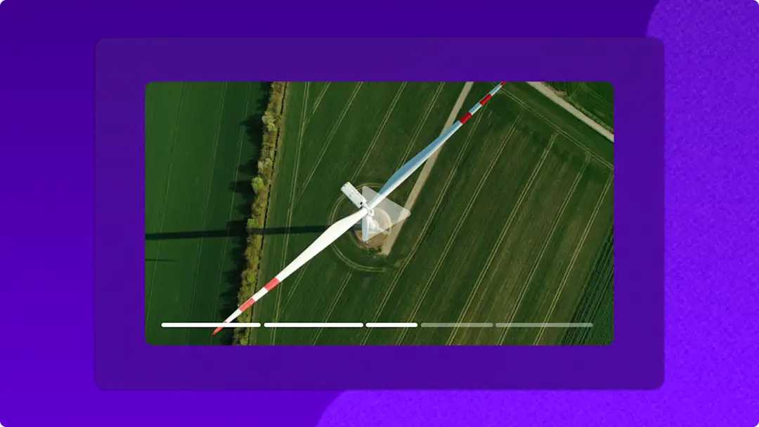
How to add chapters and timestamps to videos in ClipchampJuly 3, 2025Save viewers time by creating accessible and easy to navigate videos using timestamps...
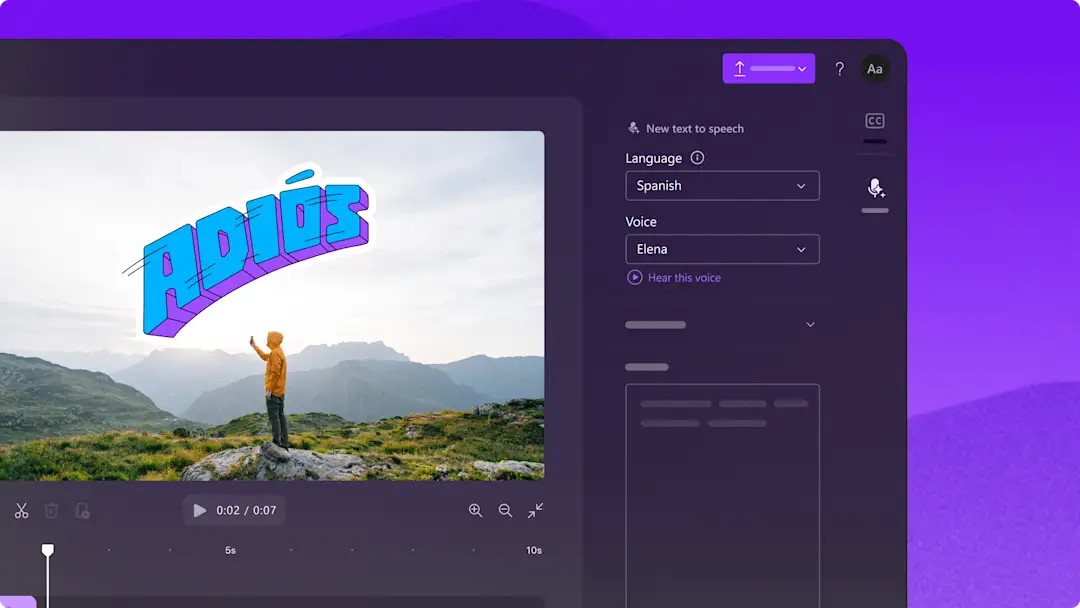
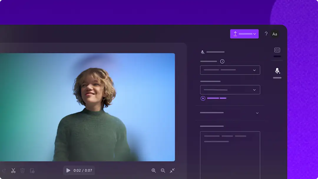
How to make Spanish text to speech voiceovers with captionsJuly 3, 2025Learn how to make Spanish video voiceovers with subtitles using the free AI text...
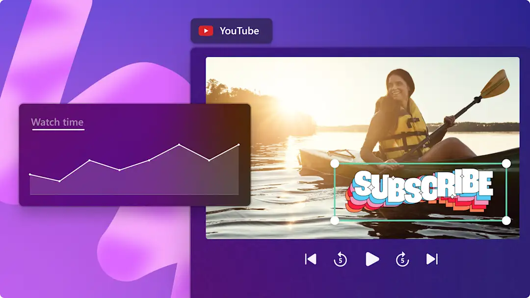
8 ways to get more watch hours on YouTubeJuly 2, 2025Learn how to increase your YouTube watch time by using tested strategies like subtitles...
How to edit videos with AI transcript-based editing in ClipchampJuly 1, 2025Learn how to trim and edit a video by deleting text from a video’s transcript, with...
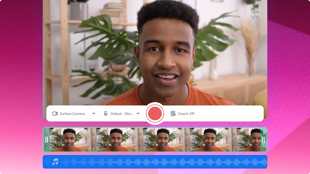
How to make demo videos for work with webcam recorderJune 24, 2025Create professional business demo videos using the webcam recorder and AI video editing...
TikTok's biggest trends right now (2025)June 20, 2025Keep track of the hottest new TikTok trends like dance challenges and trending audios...
How to make customer testimonial videos — tips and examplesJune 19, 2025Generate brand awareness and drive more conversions by making professional customer...
How to create videos using editable video templatesJune 18, 2025Learn how to create standout videos for YouTube, Instagram, TikTok and more with...
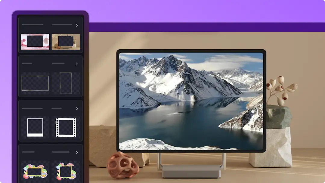
How to add frames and borders to videosJune 18, 2025Make creative, educational, and corporate videos more stylish with animated frame...
10 training video ideas for work — examples and tipsJune 17, 2025Explore 10 popular training videos examples with video editing tips in Clipchamp...
How to summarize a video in ClipchampJune 17, 2025Learn how to use the AI video summarizer using Copilot in Clipchamp. Quickly extract...
How to prompt Copilot to create a video storyboardJune 13, 2025Learn a range of AI prompts to help you make a video storyboard using Microsoft Copilot...
How to add chapters and timestamps to videos in ClipchampJuly 3, 2025Save viewers time by creating accessible and easy to navigate videos using timestamps...
How to make Spanish text to speech voiceovers with captionsJuly 3, 2025Learn how to make Spanish video voiceovers with subtitles using the free AI text...
8 ways to get more watch hours on YouTubeJuly 2, 2025Learn how to increase your YouTube watch time by using tested strategies like subtitles...